


1️⃣ Overall Concept of the Logo
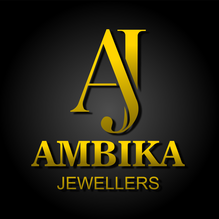
The AMBICA JEWELLERS logo uses a luxury monogram-style design combining the initials A and J with elegant typography and a premium gold color palette.
The logo clearly communicates three things:
✨ Luxury
✨ Tradition
✨ Trust
These are the three most important branding values for a jewellery business.
The combination of gold typography on a dark background instantly creates a premium and high-value brand perception, which is exactly what a jewellery brand needs.
2️⃣ Monogram Design (AJ Symbol)
The AJ monogram is the centerpiece of the logo.
Key Features
• Stylized A representing the brand name
• Elegant J curve integrated with the A
• Decorative tail element symbolizing jewellery craftsmanship
Why Monograms Work for Jewellery Brands
Luxury brands often use letter monograms because they:
✔ Look premium
✔ Are easy to remember
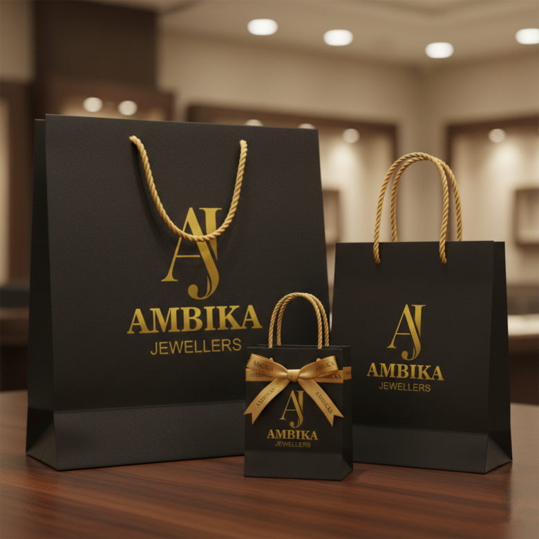
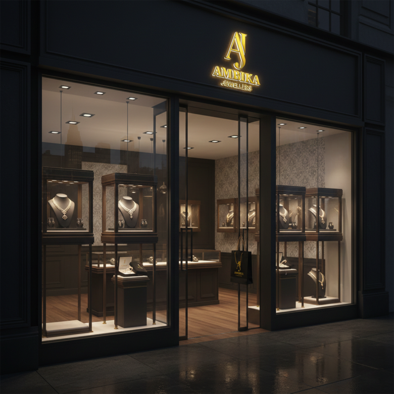
✔ Work well on jewelry boxes, bags, and store signage
Famous brands using monograms:
• Louis Vuitton
• Chanel
• Gucci
AMBICA’s AJ monogram follows this same luxury branding strategy.
3️⃣ Color Psychology
Gold Color
Gold is the most powerful color in jewellery branding.
It represents:
💰 Wealth
👑 Royalty
✨ Purity
💎 Luxury
The gradient gold tone used in the logo creates a metallic jewellery-like shine, which perfectly matches the business category.
Dark Background
The black / charcoal gradient background enhances the gold color and gives the logo:
✔ High contrast
✔ Premium feel
✔ Strong visibility
Luxury brands commonly use black + gold combinations because they signal exclusivity.
4️⃣ Typography Style
The AMBICA text uses a classic serif font which is associated with:
• Trust
• Heritage
• Craftsmanship
This is perfect for a jewellery brand because it reflects:
💍 Traditional gold jewelry
💎 Family jewellery business
🏛 Long-standing reputation
JEWELLERS Text
The word JEWELLERS is placed below the brand name in a clean style.
Purpose of this:
✔ Clarifies the business type
✔ Maintains hierarchy
✔ Keeps the logo balanced
The spacing also creates visual breathing room, improving readability.
5️⃣ Visual Hierarchy
Good logos guide the viewer’s eye in a clear order.
This logo follows a perfect hierarchy:
1️⃣ AJ Monogram (brand symbol)
2️⃣ AMBIKA (main brand name)
3️⃣ JEWELLERS (category descriptor)
This makes the logo easy to understand in seconds.
6️⃣ Symbolic Meaning
The curved tail on the J resembles jewelry craftsmanship elements such as:
✨ Gold carving
✨ Ring curves
✨ Necklace flow
This subtle design detail adds artistic elegance to the monogram.
7️⃣ Branding Versatility
A good logo must work across multiple branding materials.
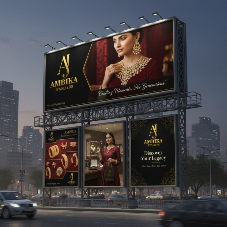
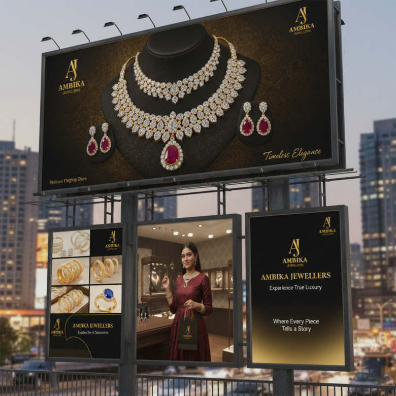
This logo will work well on:
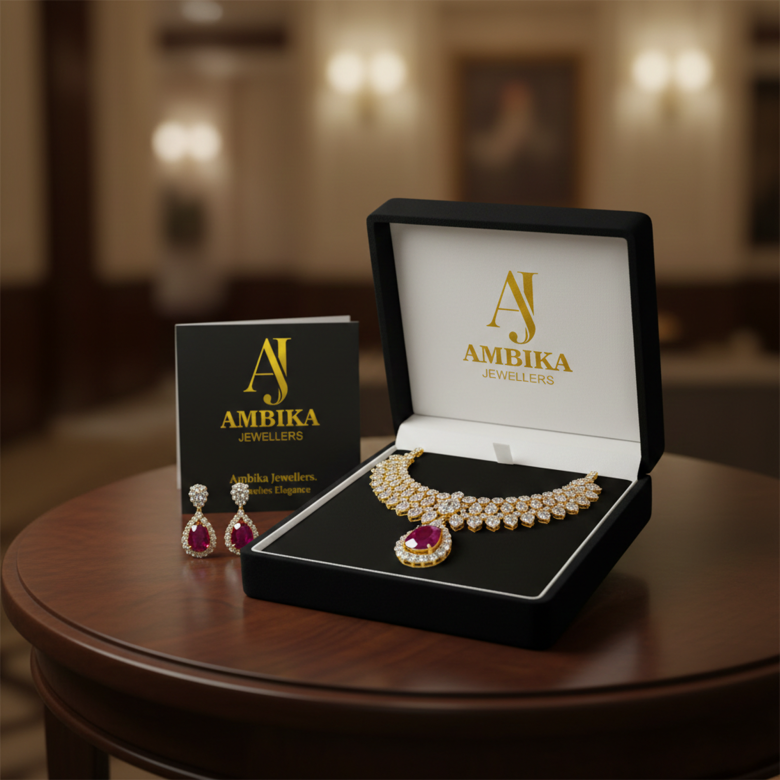
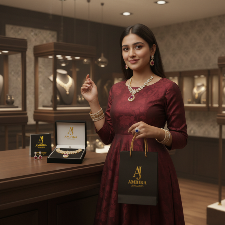
💎 Jewelry boxes
🛍 Shopping bags
📦 Packaging
🏬 Store signage
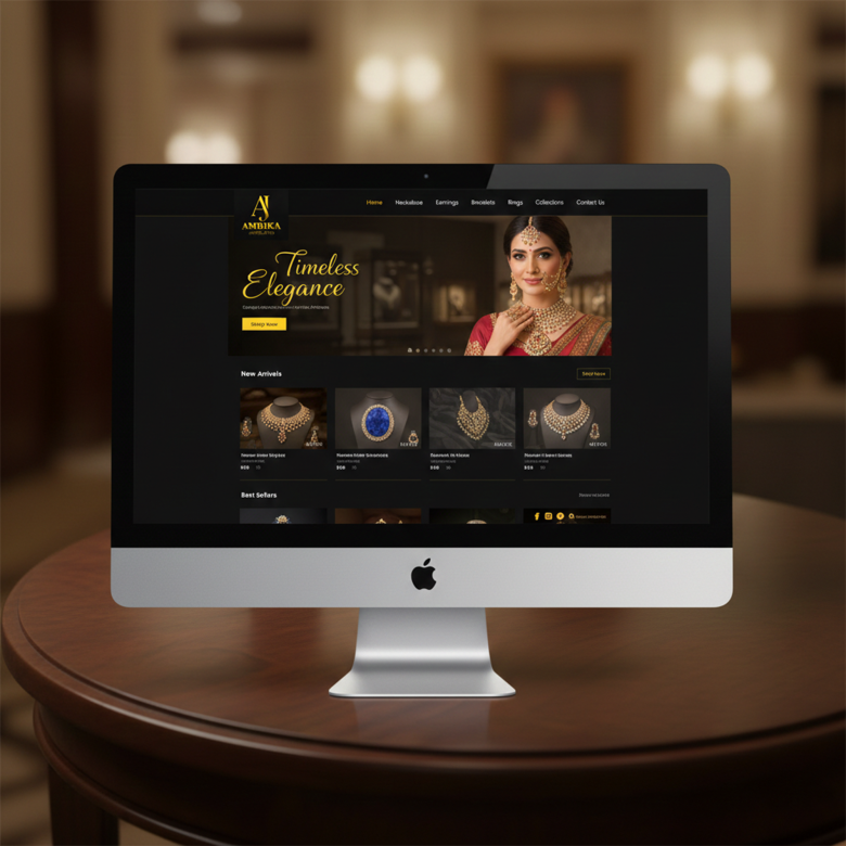
📱 Social media
🌐 Website
The monogram alone (AJ) can also be used as:
• favicon
• ring stamp
• watermark
• hallmark style mark
8️⃣ Logo Inspiration Sources
The design likely draws inspiration from luxury brand identity systems, especially:
• Cartier
• Tiffany & Co.
• Bvlgari
These brands also rely on:
✔ Elegant typography
✔ Minimal symbols
✔ Premium color palette
9️⃣ Design Workflow (How This Logo Was Likely Created)
A professional designer would follow this workflow:
Step 1 — Brand Research
Understand:
• Jewellery market
• Target customers
• Competitor brands
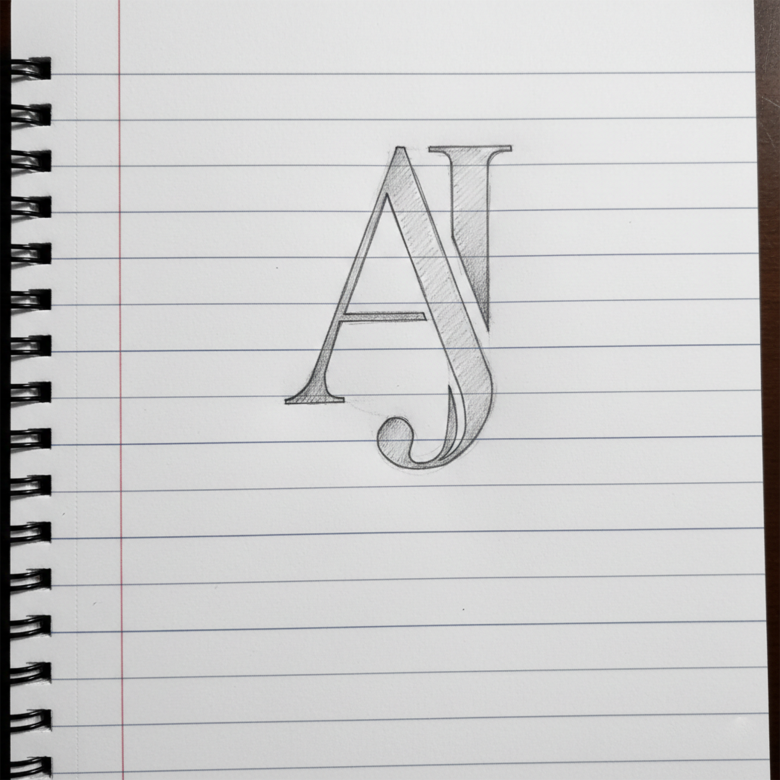
Step 2 — Monogram Sketching
Sketch initials:
A + J combinations
Different styles:
• Interlocking letters
• Overlapping letters
• Flowing calligraphy
Step 3 — Vector Creation
Convert best sketch into vector form using software like:
• Adobe Illustrator
• CorelDRAW
Step 4 — Typography Selection
Choose a luxury serif font for the brand name.
Step 5 — Color Application
Apply gold gradients and shadows to simulate metallic finish.
Step 6 — Layout & Balance
Position:
AJ icon
Brand name
Subtext
Ensure perfect symmetry and spacing.
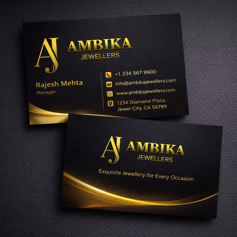
Step 7 — Mockup Testing
Test the logo on:
• Store boards
• Jewelry packaging
• Business cards
• Social media
1️⃣0️⃣ Strengths of This Logo
✔ Premium look
✔ Strong monogram identity
✔ High contrast colors
✔ Perfect for jewellery branding
✔ Elegant typography
Overall branding feel:
Luxury • Trustworthy • Traditional
1️⃣1️⃣ Possible Improvements (Optional)
To make the logo even stronger:
• Slightly reduce shadow for a more modern luxury look
• Increase spacing in JEWELLERS text
• Create a flat gold version for print
Luxury brands often keep logos simpler for scalability.
Final Verdict ⭐
The AMBICA JEWELLERS logo successfully achieves its goal of creating a premium jewellery brand identity.
It combines:
💎 Luxury monogram
👑 Elegant typography
✨ Gold prestige color
Result:
A logo that feels trustworthy, classy, and suitable for a high-end jewellery business.
✅ Overall Rating:
8.8 / 10 (Strong luxury jewellery branding)