

1️⃣ Overall Logo Concept
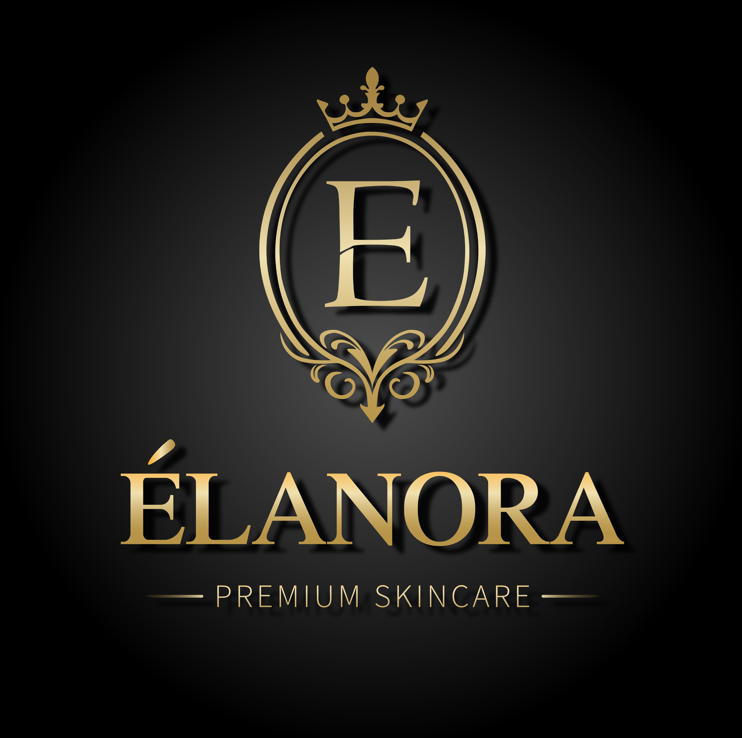
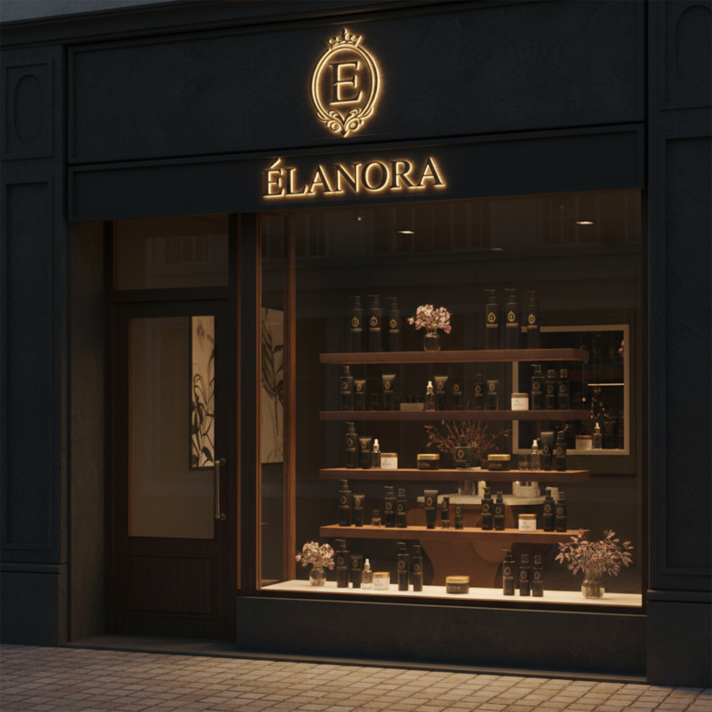
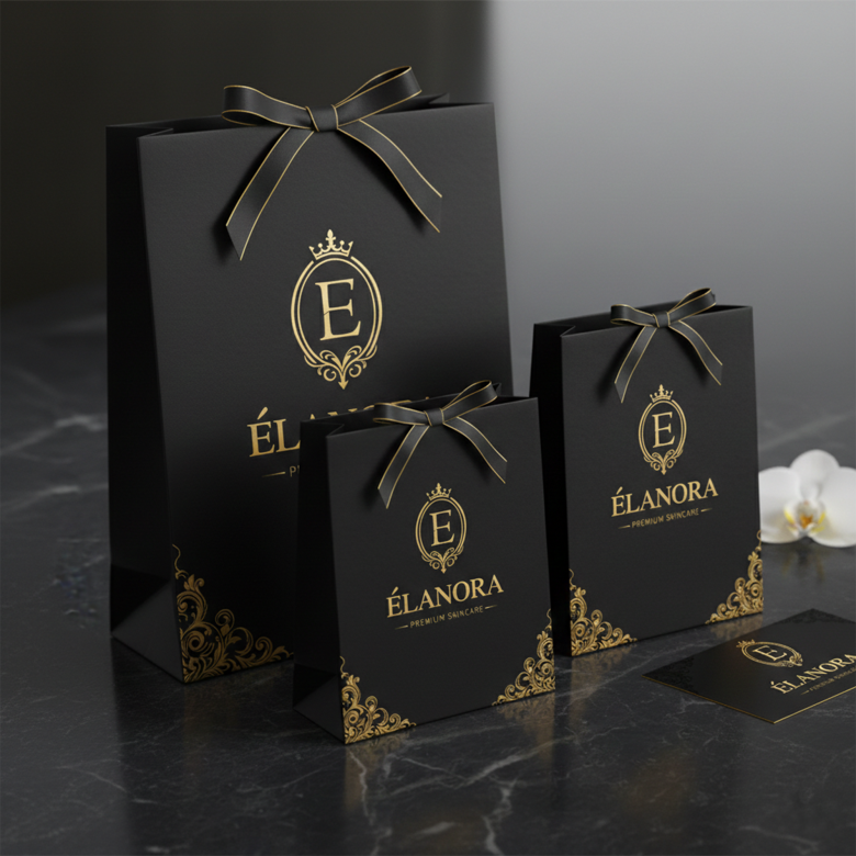
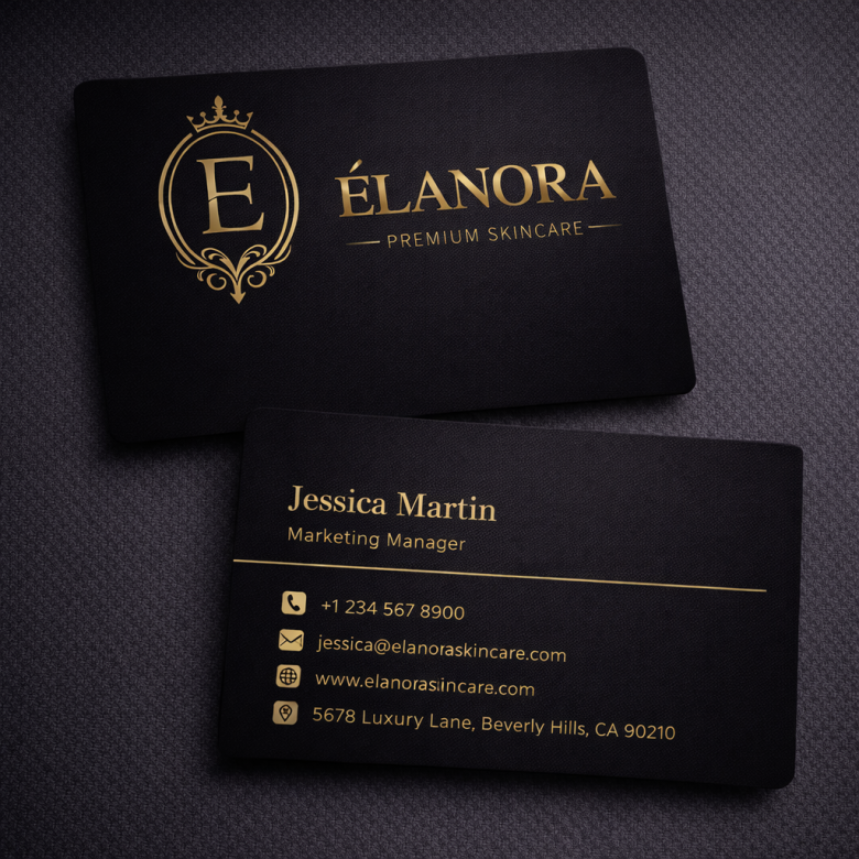
The ÉLANORA logo represents a luxury skincare brand identity built around elegance, sophistication, and premium beauty aesthetics.
The logo uses three key branding elements:
✨ Royal monogram symbol
✨ Luxury serif typography
✨ Gold on dark background color scheme
Together these elements communicate a brand positioned as:
• Premium skincare
• Elegant beauty brand
• High-end cosmetic product line
This design style is commonly used by luxury beauty brands such as:
• Estée Lauder
• La Mer
• Lancôme
These brands focus on minimal yet elegant branding that conveys prestige and trust.
2️⃣ Monogram Symbol Design
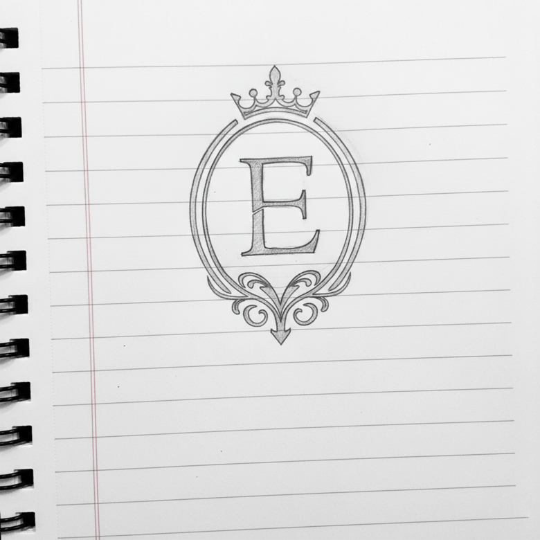
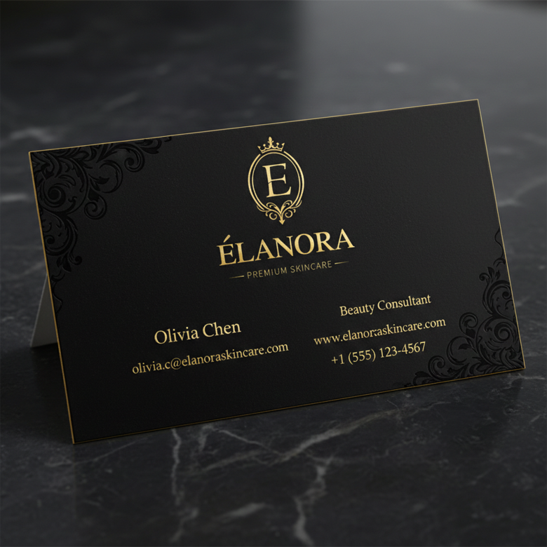
The centerpiece of the logo is the “E” monogram inside a royal emblem.
Key Components
• Letter E representing Élanora
• Oval royal frame
• Crown icon on top
• Decorative ornamental flourish at the bottom
Meaning Behind the Symbol
Each element has symbolic value:
👑 Crown
Represents luxury, authority, and premium quality skincare.
⭕ Oval frame
Symbolizes protection, beauty balance, and a timeless classic aesthetic.
🌿 Decorative flourish
Adds femininity and elegance, commonly used in beauty and perfume branding.
The result is a royal crest-style logo, which immediately signals high-end skincare products.
3️⃣ Typography Analysis
The ÉLANORA text uses a luxury serif typeface, often associated with premium brands.
Why Serif Fonts Work for Beauty Brands
Serif fonts communicate:
✔ sophistication
✔ trust
✔ heritage
✔ elegance
Many luxury brands rely on serif typography because it feels timeless and prestigious.
Examples include:
• Chanel
• Dior
The serif styling in the ÉLANORA logo supports a refined and upscale brand perception.
4️⃣ Accent Character (É)
The accented É adds a European luxury feel to the brand.
This is often used in beauty and fashion branding to evoke French elegance, which is strongly associated with the global beauty industry.
It subtly suggests:
✨ sophistication
✨ high-end formulation
✨ international cosmetic quality
5️⃣ Color Psychology
Gold Color
Gold symbolizes:
💎 luxury
👑 prestige
✨ exclusivity
🌟 premium quality
Gold is frequently used in cosmetics packaging because it visually communicates high-value products.
Dark Background
The black / dark gradient background provides:
✔ strong contrast
✔ premium aesthetic
✔ luxury mood
This combination is common in high-end brands.
Examples:
• Tom Ford
• Yves Saint Laurent
6️⃣ Logo Hierarchy
The design follows a clear visual hierarchy, which is important for brand recognition.
Order of attention:
1️⃣ Crown monogram emblem
2️⃣ ÉLANORA brand name
3️⃣ Premium Skincare tagline
This ensures viewers instantly understand:
• The brand identity
• The product category
7️⃣ Brand Positioning
This logo positions Élanora as a luxury skincare brand, similar to premium cosmetic companies.
The identity suggests products such as:
🌿 serums
🌿 anti-aging creams
🌿 luxury facial treatments
🌿 organic skincare products
The logo feels suitable for:
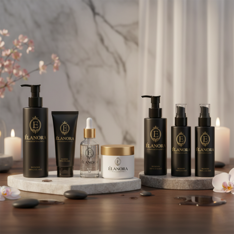
• skincare bottles
• cosmetic packaging
• spa branding
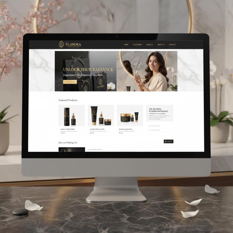
• beauty websites
8️⃣ Design Inspiration
The logo appears inspired by luxury crest-style brand identities used in:
👑 perfume brands
👑 luxury skincare lines
👑 boutique cosmetics companies
The ornamental crest design is similar to branding styles seen in premium beauty houses.
9️⃣ Professional Design Workflow
A designer likely followed this workflow while creating the logo.
Step 1 — Brand Research
Understand:
• target skincare market
• luxury cosmetic competitors
• female-focused branding aesthetics
Step 2 — Monogram Development
Create variations of the E monogram using:
• circular frames
• shields
• crests
This stage determines the brand emblem.
Step 3 — Ornament Design
Add decorative elements to create a luxury royal feel:
• crown
• floral scrollwork
• elegant curves
Step 4 — Typography Selection
Choose a luxury serif typeface that complements the emblem.
Step 5 — Color Application
Apply a gold metallic gradient to simulate luxury packaging.
Step 6 — Composition & Alignment
Balance:
• emblem
• brand name
• tagline
for perfect visual symmetry.
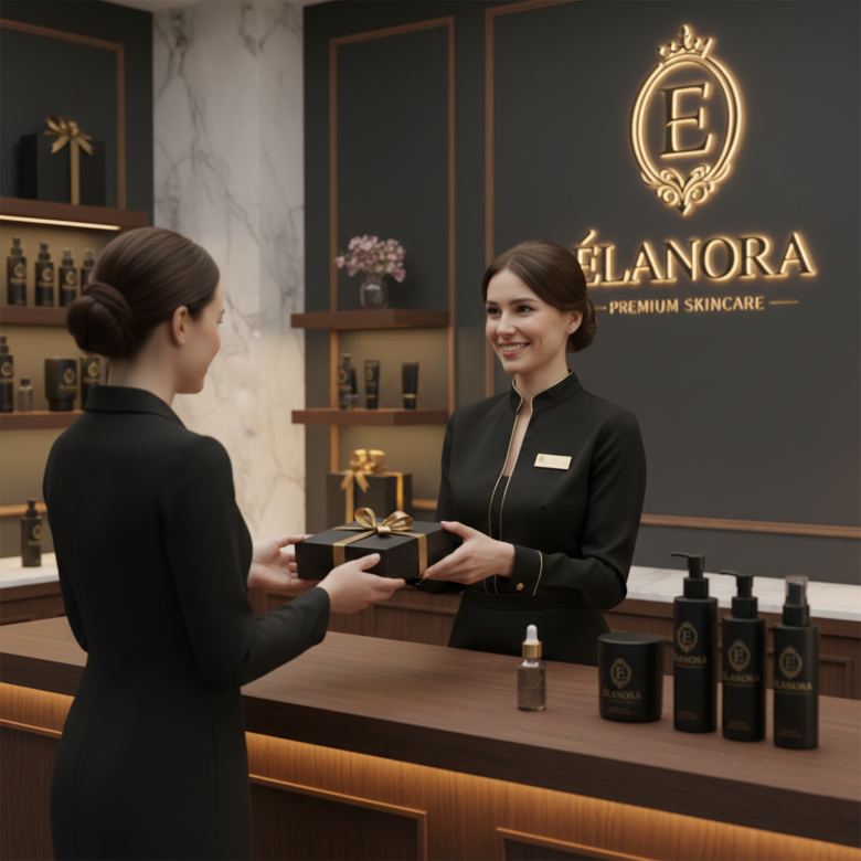
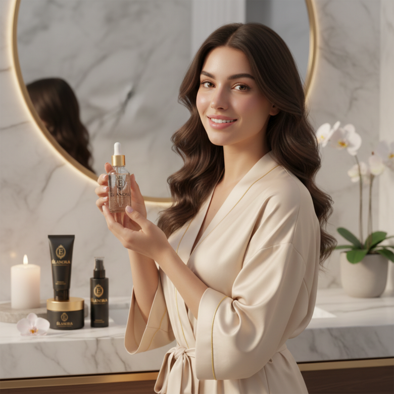
Step 7 — Mockup Testing
Test the logo on:
• skincare bottles
• cosmetic packaging
• beauty product boxes
• social media branding
🔟 Strengths of the Logo
✔ Elegant monogram emblem
✔ Strong luxury brand presence
✔ Balanced typography
✔ Suitable for skincare packaging
✔ Timeless design style
The logo successfully communicates premium beauty branding.
1️⃣1️⃣ Possible Improvements
Small refinements that could enhance the design:
• Slightly reduce the drop shadow for a more modern luxury look
• Simplify the ornamental flourish for better scalability
• Create a flat gold version for print packaging
Luxury brands often maintain minimalism for flexibility.
⭐ Final Verdict
The ÉLANORA Premium Skincare logo effectively captures the feeling of a high-end beauty brand.
It combines:
🌿 elegant typography
👑 royal emblem symbolism
✨ luxury gold aesthetics
Resulting in a brand identity that feels:
Premium • Sophisticated • Trustworthy
✅ Overall Rating:
⭐ 9 / 10 – Strong luxury beauty branding