

1️⃣ Logo Idea (Concept Behind the Design)
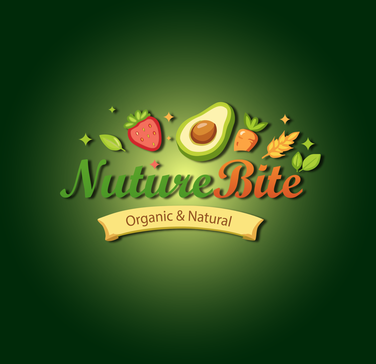
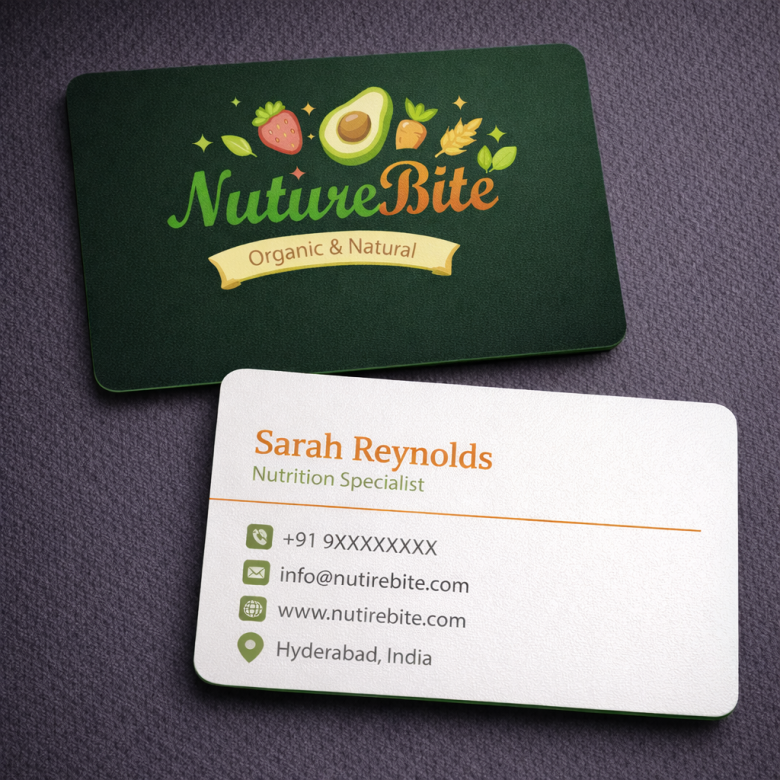
The core idea of this logo is to represent healthy, organic, and natural food in a friendly and modern way.
Key concept elements:
- Fresh ingredients → Strawberry, avocado, carrot, wheat, and leaves represent natural nutrition.
- Green color palette → Symbolizes nature, freshness, sustainability, and organic farming.
- Soft typography → Gives a warm and approachable brand personality.
- Food icons around the name → Visually communicates that the brand focuses on healthy bites / natural foods.
Overall message the logo communicates:
“Fresh, natural, and nutritious food for a healthy lifestyle.”
🎨 2️⃣ Design Inspiration
This logo style is inspired by modern organic food brands and eco-friendly packaging design.
Key inspiration sources
1. Organic Food Branding
- Natural color palettes
- Fruits and vegetables as visual symbols
- Eco-friendly brand image
2. Healthy Lifestyle Brands
- Clean design
- Fresh ingredients illustrations
- Light and friendly typography
3. Farm-to-Table Movement
- Natural produce visuals
- Handcrafted feeling
- Honest and healthy brand communication
🍓 3️⃣ Visual Elements Breakdown
🥑 Food Illustrations
The ingredients above the name create an instant healthy food identity.
Items included:
- Strawberry → freshness & antioxidants
- Avocado → healthy fats / superfood
- Carrot → vitamins & natural farming
- Wheat → whole grains & nutrition
- Leaves → organic and eco-friendly
These elements help customers immediately understand the brand category.
🌿 Color Psychology
Main colors used:
Green
- Nature
- Freshness
- Sustainability
- Organic farming
Orange
- Energy
- Appetite
- Warmth
- Food appeal
Yellow ribbon
- Warm organic label feeling
- Handmade / farm brand vibe
The gradient background also gives depth and modern packaging appeal.
✍ Typography
The script style typography gives:
- Friendly personality
- Natural brand feeling
- Handmade organic product vibe
“Nuture” in green
“Bite” in orange
This color contrast creates visual hierarchy.
📦 4️⃣ Branding Strengths
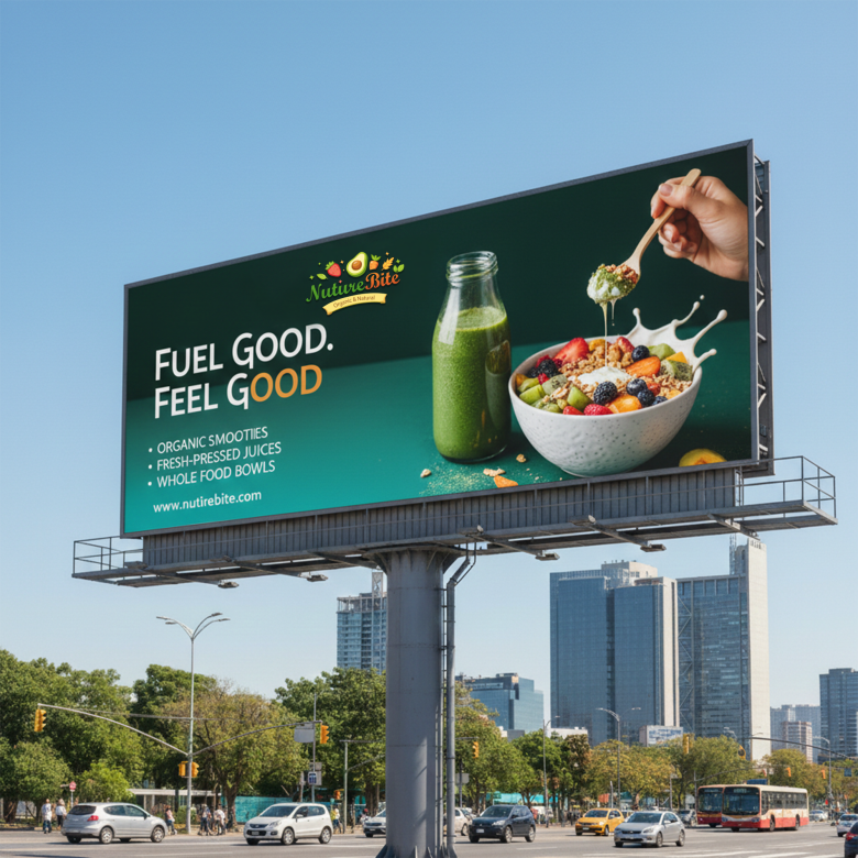
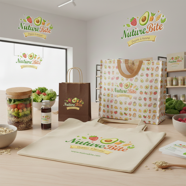
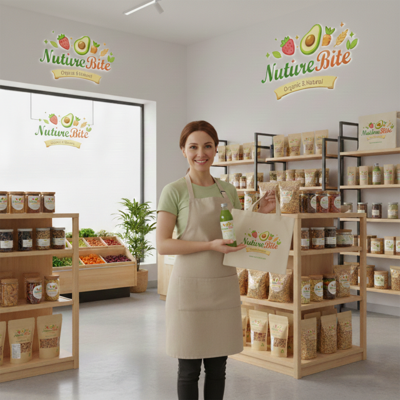
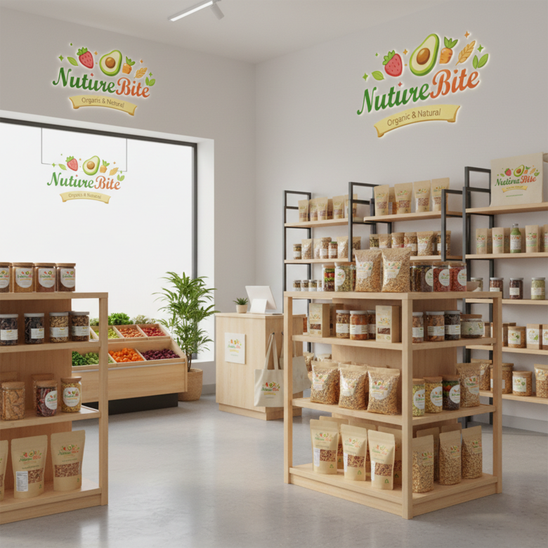
This logo works well for:
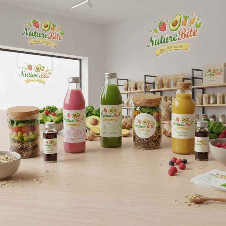
✔ Organic food packaging
✔ Healthy snack brands
✔ Juice bars
✔ Vegan brands
✔ Farmers market products
✔ Healthy cafés
It also fits well for:
- Labels
- Social media
- Product packaging
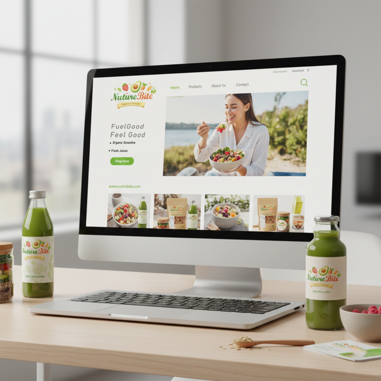
- Website branding
⚙ 5️⃣ Design Workflow (How This Logo Was Likely Created)
Step 1 — Brand Research
Understanding the brand idea:
- Organic food
- Healthy lifestyle
- Natural ingredients
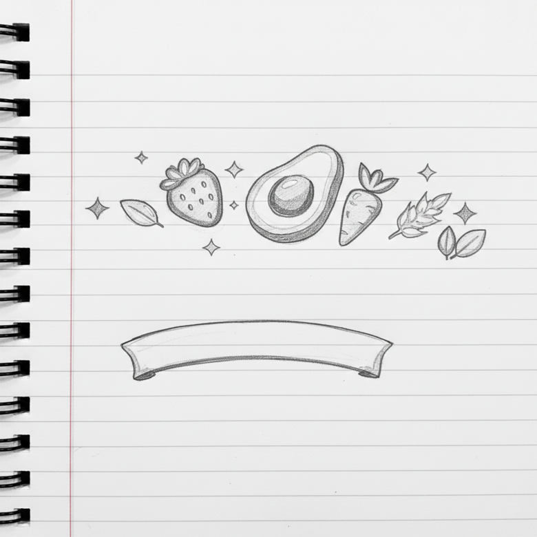
Step 2 — Concept Sketching
Sketch ideas like:
- Fruits around the name
- Nature symbols
- Leaves + food icons
- Organic badge style
Step 3 — Icon Illustration
Create flat vector illustrations of:
- Strawberry
- Avocado
- Carrot
- Wheat
- Leaves
These were likely created in Adobe Illustrator or similar vector software.
Step 4 — Typography Selection
Choose a soft organic script font to give:
- Friendly personality
- Natural food brand feeling
Then adjust colors and spacing.
Step 5 — Composition Layout
Arrange elements:
Top: food icons
Center: brand name
Bottom: ribbon tagline
This creates visual balance.
Step 6 — Color Styling
Apply brand colors:
- Green gradient background
- Natural ingredient colors
- Yellow ribbon for tagline
Step 7 — Final Polish
Add:
- Shadows
- Glow highlights
- Decorative sparkles
- Depth effects
This gives the logo a modern packaging-ready look.
⭐ Overall Design Rating
Concept: ⭐⭐⭐⭐⭐
Color harmony: ⭐⭐⭐⭐☆
Brand clarity: ⭐⭐⭐⭐⭐
Professional look: ⭐⭐⭐⭐☆
Overall: Very strong organic brand identity.