









1️⃣ Overall Logo Concept
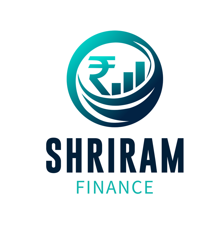
The SHRIRAM FINANCE logo reflects a modern financial services brand identity. The design combines financial symbols with a clean corporate style to communicate growth, trust, and stability.
The logo clearly represents:
📈 Financial growth
💰 Money management
🏦 Corporate professionalism
📊 Investment success
The use of financial symbols like the ₹ (Indian Rupee sign) and growth bar chart immediately communicates the company’s focus on financial services.
This type of visual branding is commonly used in finance companies similar to HDFC Bank and Bajaj Finance.
2️⃣ Symbol Design (Rupee + Growth Chart)
The central icon of the logo combines two key financial elements.
Key Components
₹ Rupee Symbol
The rupee sign represents:
💰 Indian financial markets
💰 money transactions
💰 financial services
This immediately signals that the brand operates within the Indian financial ecosystem.
Bar Chart (Growth Graph)
The bar graph symbolizes:
📊 financial growth
📊 investment performance
📊 business expansion
Growth charts are widely used in finance branding because they visually communicate profit and progress.
Circular Shape
The circular structure surrounding the symbol represents:
🔄 financial flow
🌍 global finance
🔒 stability and protection
Circular logos are often used by financial brands because they symbolize security and completeness.
3️⃣ Color Psychology
The logo uses a teal and navy blue gradient, which is very effective in financial branding.
Blue / Teal Meaning
Blue tones represent:
💙 trust
💙 stability
💙 professionalism
💙 reliability
This is why many financial institutions rely heavily on blue branding.
Examples include:
• PayPal
• Visa
4️⃣ Typography Analysis
The SHRIRAM text uses a bold sans-serif font, which gives the brand a strong corporate presence.
Characteristics of the typography:
✔ clean
✔ bold
✔ professional
✔ easy to read
Sans-serif fonts are commonly used in finance and corporate branding because they feel modern and trustworthy.
FINANCE Text
The FINANCE text appears in a lighter color and smaller size to maintain hierarchy.
This creates a clear structure:
1️⃣ Icon
2️⃣ Brand name (SHRIRAM)
3️⃣ Business category (FINANCE)
5️⃣ Visual Hierarchy
The design has a strong visual structure that directs attention naturally.
Order of viewing:
1️⃣ Financial icon (₹ + growth chart)
2️⃣ Brand name “SHRIRAM”
3️⃣ Descriptor “FINANCE”
This ensures viewers instantly understand that the brand deals with financial services and investments.
6️⃣ Brand Positioning
The logo positions Shriram Finance as a brand that focuses on:
📈 financial growth
💰 investment services
🏦 financial stability
📊 business finance
The design suggests services such as:
• loans
• financial planning
• business funding
• investment services
7️⃣ Design Inspiration
The logo appears inspired by common design patterns used in financial and fintech branding, where companies integrate financial symbols and growth indicators.
Financial branding often uses elements such as:
📊 charts
💹 arrows
💰 currency symbols
🔵 corporate colors
These elements instantly communicate financial expertise and growth.
8️⃣ Design Style
The logo follows a modern fintech-style design.
Key characteristics include:
✔ minimal shapes
✔ gradient colors
✔ financial iconography
✔ clean typography
This modern style works well in digital environments such as apps and websites.
9️⃣ Professional Logo Design Workflow
A designer creating this logo would typically follow a structured process.
Step 1 — Brand Research
Understand:
• financial services offered
• target customers
• competitor finance brands
Step 2 — Concept Development
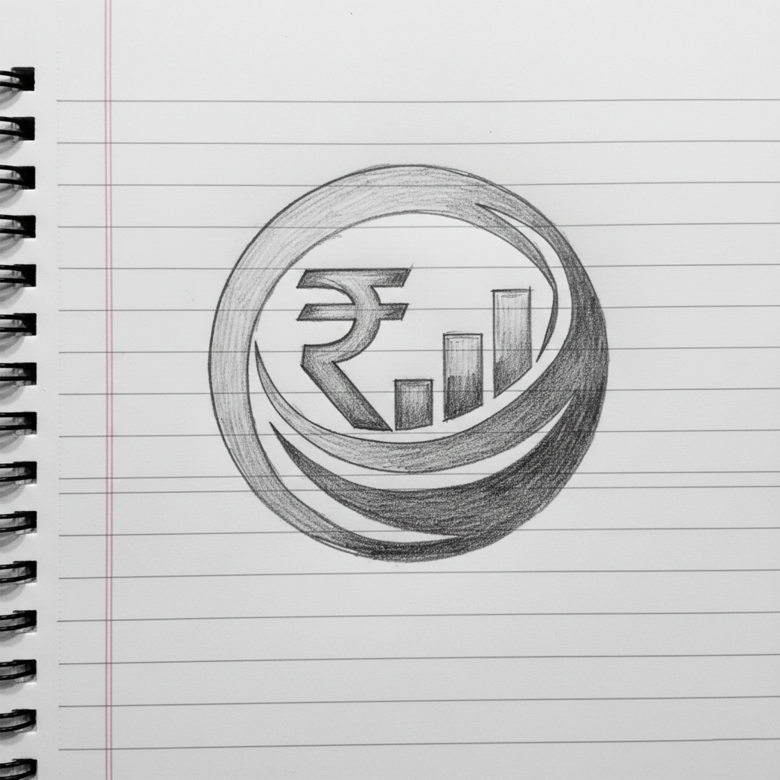
Create symbol ideas using:
• rupee symbols
• financial charts
• arrows representing growth
Step 3 — Icon Creation
Combine the rupee symbol with a bar chart inside a circular frame to create a unified financial icon.
Step 4 — Typography Selection
Choose a bold sans-serif font for a strong corporate look.
Step 5 — Color Palette
Select corporate finance colors such as:
• blue
• teal
• navy
Step 6 — Vector Design
Build the logo using professional vector software like:
• Adobe Illustrator
• CorelDRAW
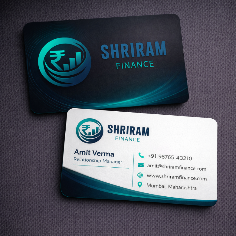
Step 7 — Brand Testing
Test the logo on:
• finance apps
• websites
• documents
• business cards
• advertising banners
🔟 Strengths of the Logo
✔ Strong financial symbolism
✔ Modern corporate design
✔ Clear business identity
✔ Professional color palette
✔ Scalable icon design
The logo successfully communicates financial growth and trust.
1️⃣1️⃣ Possible Improvements
Some minor improvements could enhance the design further:
• Reduce gradient complexity for easier printing
• Slightly refine the rupee symbol alignment
• Create a simplified icon version for mobile apps
These adjustments would improve the logo’s adaptability across different platforms.
⭐ Final Verdict
The SHRIRAM FINANCE logo effectively represents a modern financial services brand.
By combining:
📈 growth chart symbolism
💰 rupee financial identity
🔵 trusted corporate colors
the logo creates a brand image that feels:
Reliable • Professional • Growth-focused
✅ Overall Rating:
⭐ 8.8 / 10 – Strong financial brand identity