







1️⃣ Overall Logo Concept
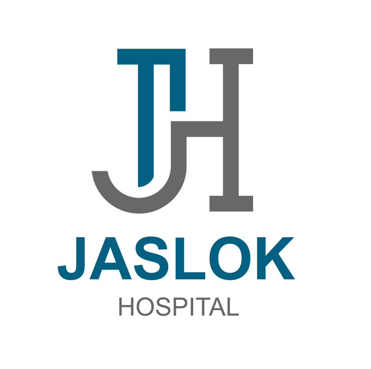
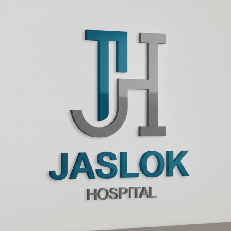
The JASLOK HOSPITAL logo follows a modern healthcare branding approach that emphasizes:
✔ Simplicity
✔ Trust
✔ Professionalism
✔ Medical reliability
The design combines a clean monogram (JH) with modern typography, which is commonly used in hospital and healthcare branding.
This type of identity helps hospitals appear:
🏥 Professional
👨⚕️ Trustworthy
🩺 Modern and organized
2️⃣ Monogram Design (JH Symbol)
The central symbol in the logo is the JH monogram, representing:
J — Jaslok
H — Hospital
Design Characteristics
• Interlocking letters
• Geometric shapes
• Balanced structure
The J and H are merged together, creating a unified healthcare identity.
Symbolic Meaning
The connected letters represent:
🤝 collaboration in healthcare
🩺 integrated medical services
🏥 strong institutional identity
Monogram logos are widely used in institutions because they are easy to recognize and highly scalable.
Examples include hospitals and institutions like:
• Mayo Clinic
• Cleveland Clinic
3️⃣ Color Psychology
The logo uses blue and grey, which are among the most trusted colors in medical branding.
Blue Color Meaning
Blue represents:
💙 trust
💙 reliability
💙 safety
💙 professionalism
Blue is the most commonly used color in healthcare branding.
Grey Color Meaning
Grey symbolizes:
⚙ stability
⚙ professionalism
⚙ balance
It complements blue and makes the logo feel modern and professional.
4️⃣ Typography Analysis
The typography used in JASLOK appears to be a clean sans-serif font, which communicates:
✔ clarity
✔ modern healthcare systems
✔ easy readability
Sans-serif fonts are widely used in hospitals because they look clean, contemporary, and professional.
Tagline Text: HOSPITAL
The smaller HOSPITAL text helps clarify the brand identity and service category.
This improves recognition for:
• patients
• visitors
• healthcare partners
5️⃣ Visual Hierarchy
The logo follows a strong visual structure.
Order of attention:
1️⃣ JH monogram symbol
2️⃣ JASLOK brand name
3️⃣ HOSPITAL descriptor
This structure ensures immediate brand recognition.
6️⃣ Design Style
The logo follows a minimalist corporate design style.
Key characteristics:
✔ clean shapes
✔ simple colors
✔ minimal decoration
✔ modern layout
This approach is ideal for healthcare institutions because it builds trust and credibility.
7️⃣ Brand Positioning
The design positions Jaslok Hospital as:
🏥 a modern medical institution
🩺 a reliable healthcare provider
👨⚕️ a professional hospital brand
The logo works well across many healthcare applications.
8️⃣ Where This Logo Works Best
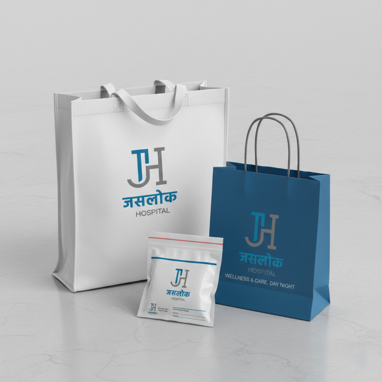
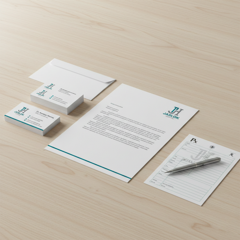
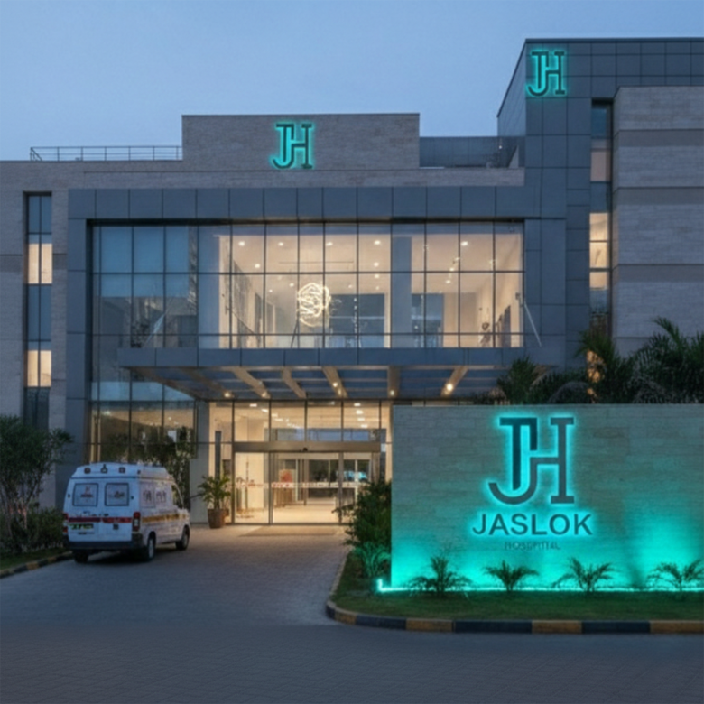
This type of logo performs well on:
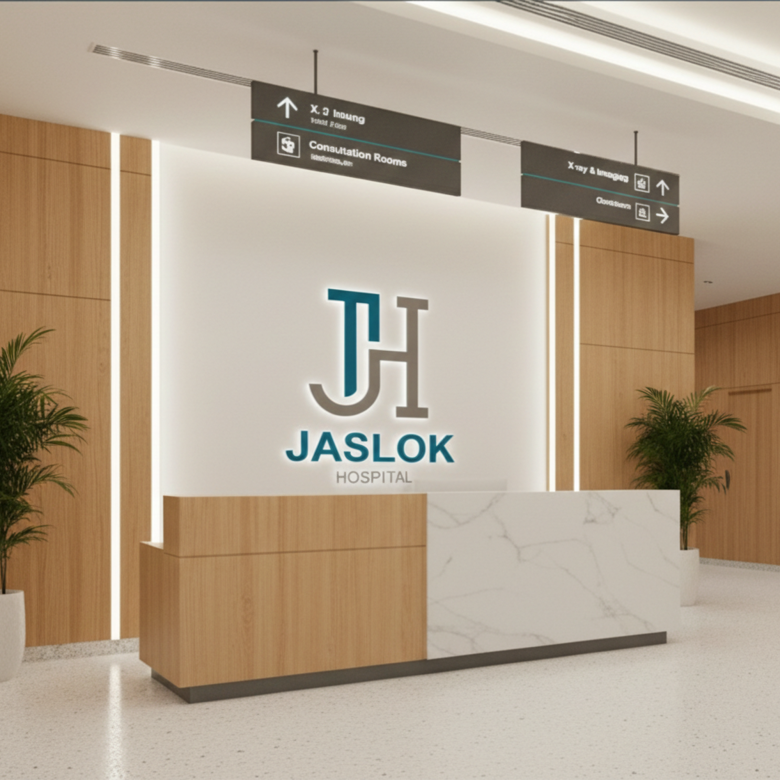
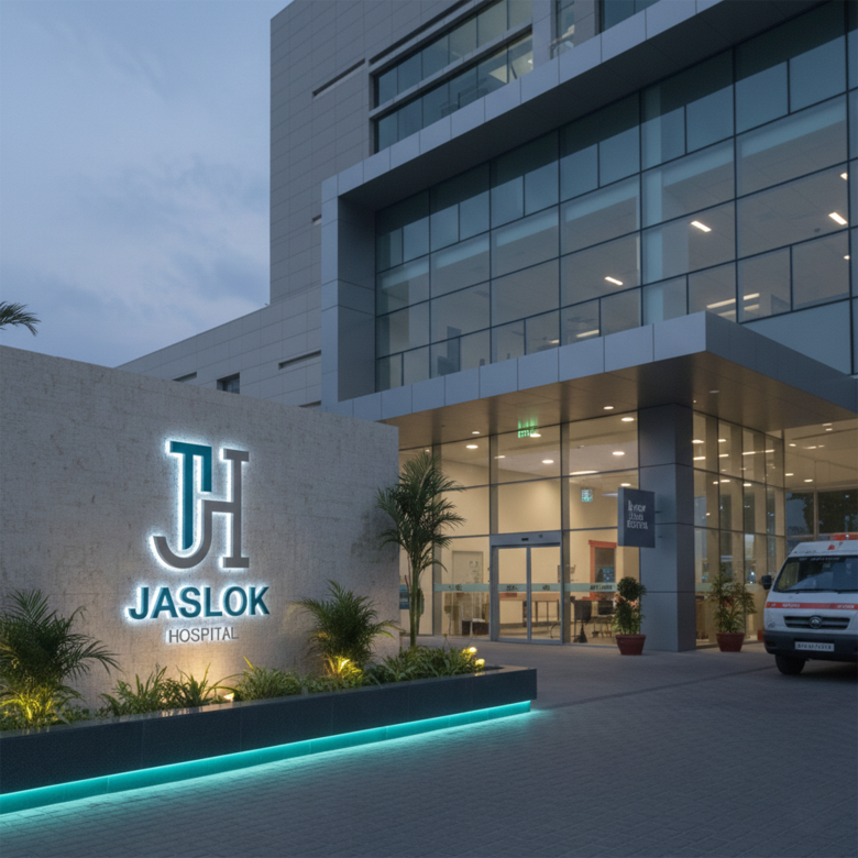
🏥 hospital building signage
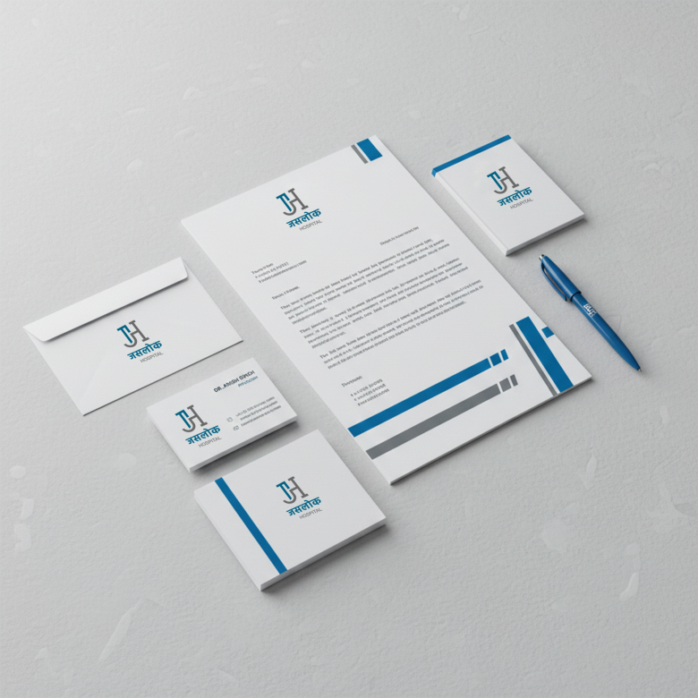
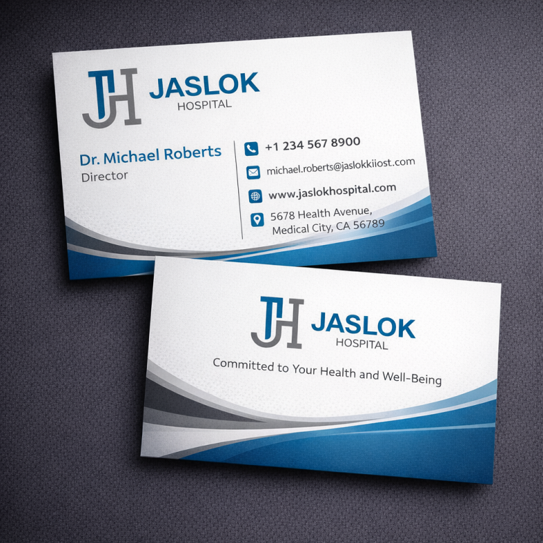
📄 medical documents
💻 hospital websites
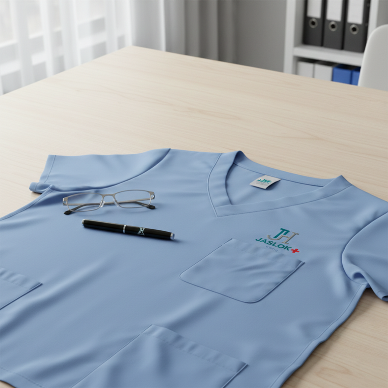
🩺 doctor uniforms
🚑 ambulances
📱 healthcare apps
Its simplicity ensures strong visibility across all mediums.
9️⃣ Design Inspiration
The logo appears inspired by modern healthcare brand systems used globally.
Common inspirations include:
• Johns Hopkins Hospital
• Apollo Hospitals
These institutions often rely on clean monograms and simple typography.
🔟 Professional Logo Design Workflow
A designer would typically follow this process.
Step 1 — Healthcare Brand Research
Understand:
• hospital services
• patient demographics
• competitor hospital brands
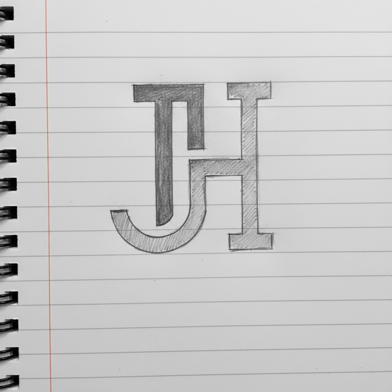
Step 2 — Initial Sketching
Create monogram ideas:
• JH combinations
• geometric shapes
• interlocking letters
Step 3 — Vector Design
Convert the best concept into vector format using tools such as:
• Adobe Illustrator
• CorelDRAW
Step 4 — Color Testing
Test healthcare colors such as:
• blue
• teal
• grey
Step 5 — Typography Pairing
Select modern sans-serif fonts for clarity and readability.
Step 6 — Layout Refinement
Balance the elements:
• symbol
• brand name
• descriptor
Step 7 — Branding Mockups
Test the logo on:
• hospital signage
• stationery
• uniforms
• digital platforms
1️⃣1️⃣ Strengths of the Logo
✔ Clear healthcare identity
✔ Clean and modern design
✔ Professional color palette
✔ Strong monogram symbol
✔ Highly scalable
The design communicates trust and medical reliability.
1️⃣2️⃣ Possible Improvements
Some small enhancements could include:
• Slightly increasing spacing in JASLOK text
• Creating a flat color version for printing
• Adding a subtle medical symbol variation for marketing materials
However, the current design already works well for institutional healthcare branding.
⭐ Final Verdict
The JASLOK HOSPITAL logo successfully reflects a modern healthcare institution.
It combines:
🩺 clean monogram design
💙 trusted medical colors
🏥 professional typography
Resulting in a brand identity that feels:
Reliable • Professional • Modern
✅ Overall Rating:
⭐ 8.7 / 10 – Strong healthcare brand identity