




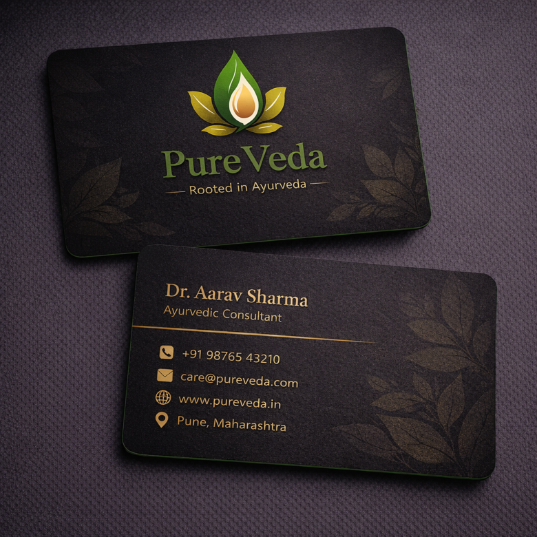
1️⃣ Overall Logo Concept
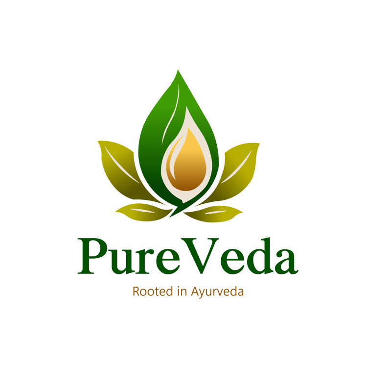
The PureVeda logo represents a brand strongly connected to natural wellness and traditional Ayurveda. The design combines botanical elements with warm earthy colors to communicate purity, health, and holistic healing.
The visual identity immediately suggests:
🌿 Natural ingredients
🌿 Herbal wellness
🌿 Ayurvedic tradition
🌿 Organic products
This type of logo works well for businesses involved in:
- Ayurvedic medicines
- Herbal skincare
- Organic wellness products
- Natural supplements
The overall branding style aligns with modern Ayurvedic brands like Patanjali and Himalaya Wellness that emphasize natural healing and plant-based ingredients.
2️⃣ Symbol Design (Leaf & Drop Icon)
The icon in the logo is a combination of leaves and a golden drop, forming a balanced botanical symbol.
Key Elements
Green leaf structure
Represents nature, herbal plants, and Ayurvedic ingredients.
Golden drop at the center
Symbolizes natural oils, herbal extracts, or healing essence.
Symmetrical leaf arrangement
Creates a sense of harmony and balance, which reflects Ayurvedic philosophy.
Symbolic Meaning
Each element represents Ayurvedic principles:
🌿 Leaves = nature and plant medicine
💧 Drop = purity and herbal extracts
⚖ Balance = holistic health and body harmony
The structure resembles a lotus-inspired herbal symbol, which is commonly associated with wellness and spiritual healing.
3️⃣ Color Psychology
The logo uses a green and gold color palette, which is ideal for Ayurvedic branding.
Green Color
Green represents:
🌿 nature
🌿 healing
🌿 growth
🌿 organic purity
Green is the most widely used color in herbal and wellness brands.
Gold / Golden Yellow Color
The golden drop symbolizes:
✨ purity
✨ energy
✨ natural vitality
It also adds a premium feel to the brand while staying connected to nature.
4️⃣ Typography Style
The PureVeda text uses a classic serif-style typography, which creates a balance between tradition and trust.
Serif fonts are commonly used in Ayurvedic and wellness brands because they convey:
✔ authenticity
✔ heritage
✔ traditional knowledge
This type of typography reflects the ancient roots of Ayurveda, which originated in India thousands of years ago.
The concept of Ayurveda is rooted in the ancient medical system known as Ayurveda.
5️⃣ Tagline: “Rooted in Ayurveda”
The tagline strengthens the brand identity by highlighting its foundation in traditional medicine.
This phrase communicates:
🌿 authenticity
🌿 herbal heritage
🌿 natural healing philosophy
It reassures customers that the brand focuses on Ayurvedic principles and plant-based formulations.
6️⃣ Visual Hierarchy
The logo has a clear visual structure that guides the viewer’s attention.
1️⃣ Herbal symbol (leaf + drop)
2️⃣ Brand name “PureVeda”
3️⃣ Tagline “Rooted in Ayurveda”
This hierarchy ensures that viewers instantly understand the brand’s focus on natural wellness.
7️⃣ Brand Positioning
The logo positions PureVeda as a brand focused on:
🌿 Ayurvedic wellness
🌿 herbal skincare
🌿 organic health products
🌿 natural healing
The branding style would fit well for:
- herbal product packaging
- Ayurvedic clinic branding
- wellness centers
- organic skincare brands
8️⃣ Design Inspiration
The design appears inspired by common elements in Ayurvedic and organic branding, including:
🌿 lotus flower symbolism
🌿 herbal leaves
🌿 natural oil drops
Many wellness brands incorporate botanical elements to visually communicate natural purity and plant-based ingredients.
9️⃣ Professional Logo Design Workflow
A designer creating this logo would typically follow this process.
Step 1 — Brand Research
Understand the brand’s focus on:
- Ayurvedic medicine
- herbal ingredients
- natural wellness
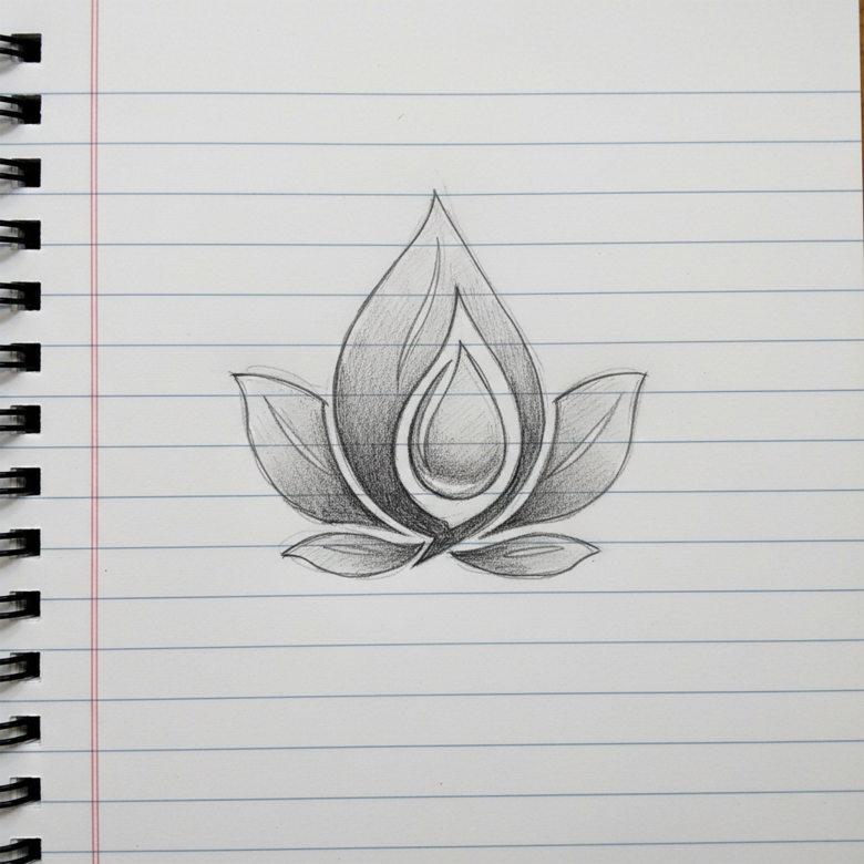
Step 2 — Concept Sketching
Sketch different ideas using:
- leaf icons
- lotus symbols
- herbal drops
- plant shapes
Step 3 — Symbol Development
Create a balanced botanical icon by combining leaves and a drop shape.
Step 4 — Typography Selection
Choose a serif font to emphasize traditional Ayurvedic heritage.
Step 5 — Color Palette Design
Select earthy colors like:
- green
- golden yellow
- natural tones
Step 6 — Vector Creation
Convert the final concept into vector format using professional software such as:
- Adobe Illustrator
- CorelDRAW
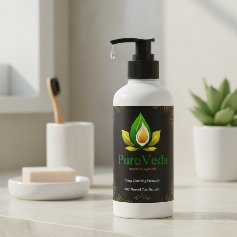
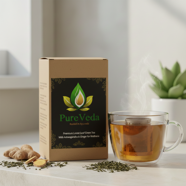
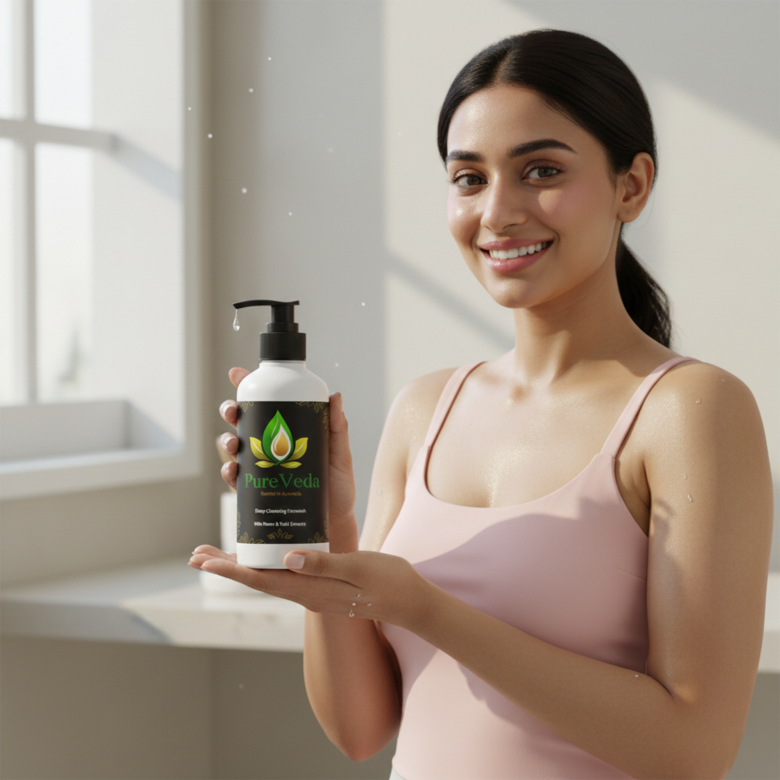
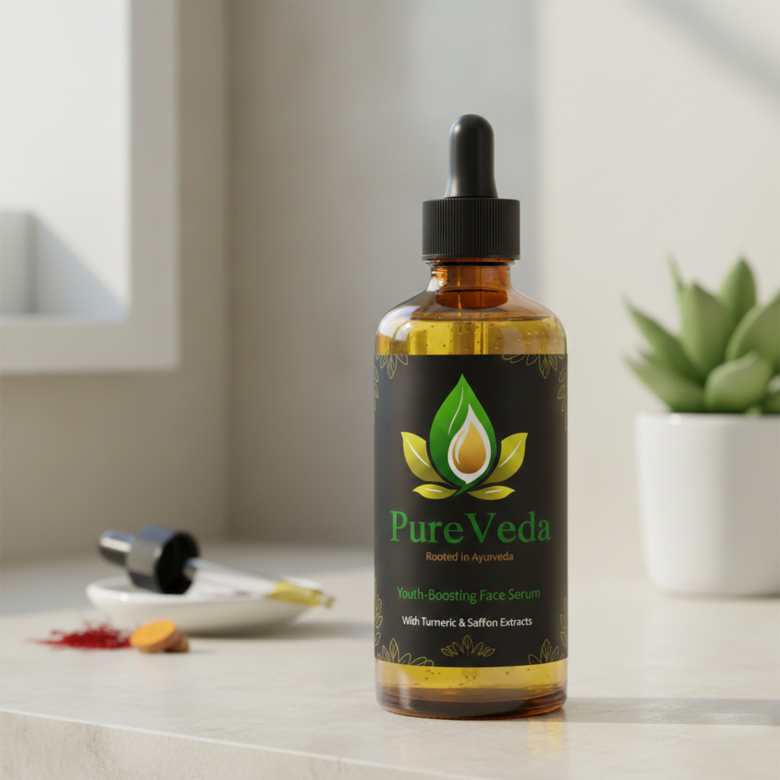
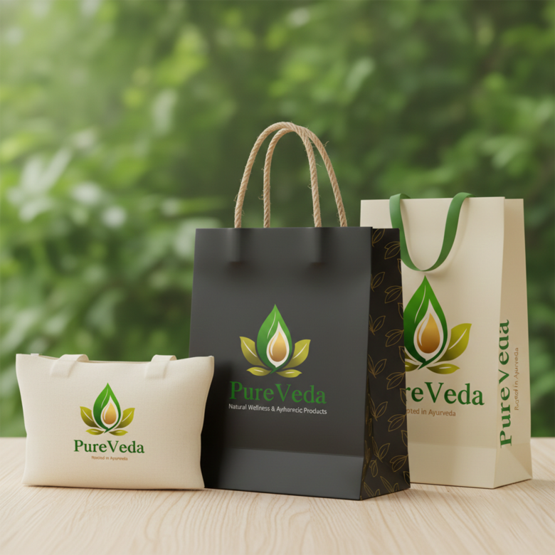
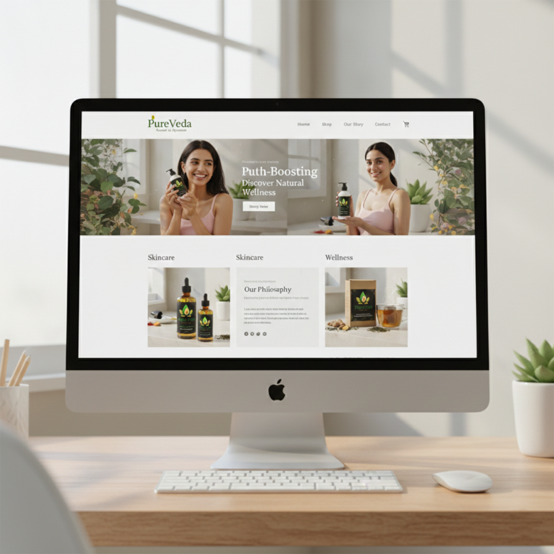
Step 7 — Brand Mockups
Test the logo on:
- herbal product packaging
- Ayurvedic medicine bottles
- wellness websites
- organic product labels
🔟 Strengths of the Logo
✔ Strong herbal identity
✔ Balanced botanical icon
✔ Natural color palette
✔ Clear Ayurvedic connection
✔ Simple and memorable design
The logo clearly communicates natural wellness and herbal purity.
1️⃣1️⃣ Possible Improvements
A few small refinements could enhance the design further:
• Slightly simplify leaf details for better scalability
• Increase tagline contrast for improved readability
• Create a flat single-color version for packaging
These improvements would help the logo perform better across multiple platforms.
⭐ Final Verdict
The PureVeda logo successfully captures the essence of a natural Ayurvedic wellness brand.
By combining:
🌿 botanical symbolism
✨ warm natural colors
📜 traditional typography
the logo conveys a brand identity that feels:
Natural • Pure • Holistic • Authentic
✅ Overall Rating:
⭐ 9 / 10 – Strong Ayurvedic brand identity