


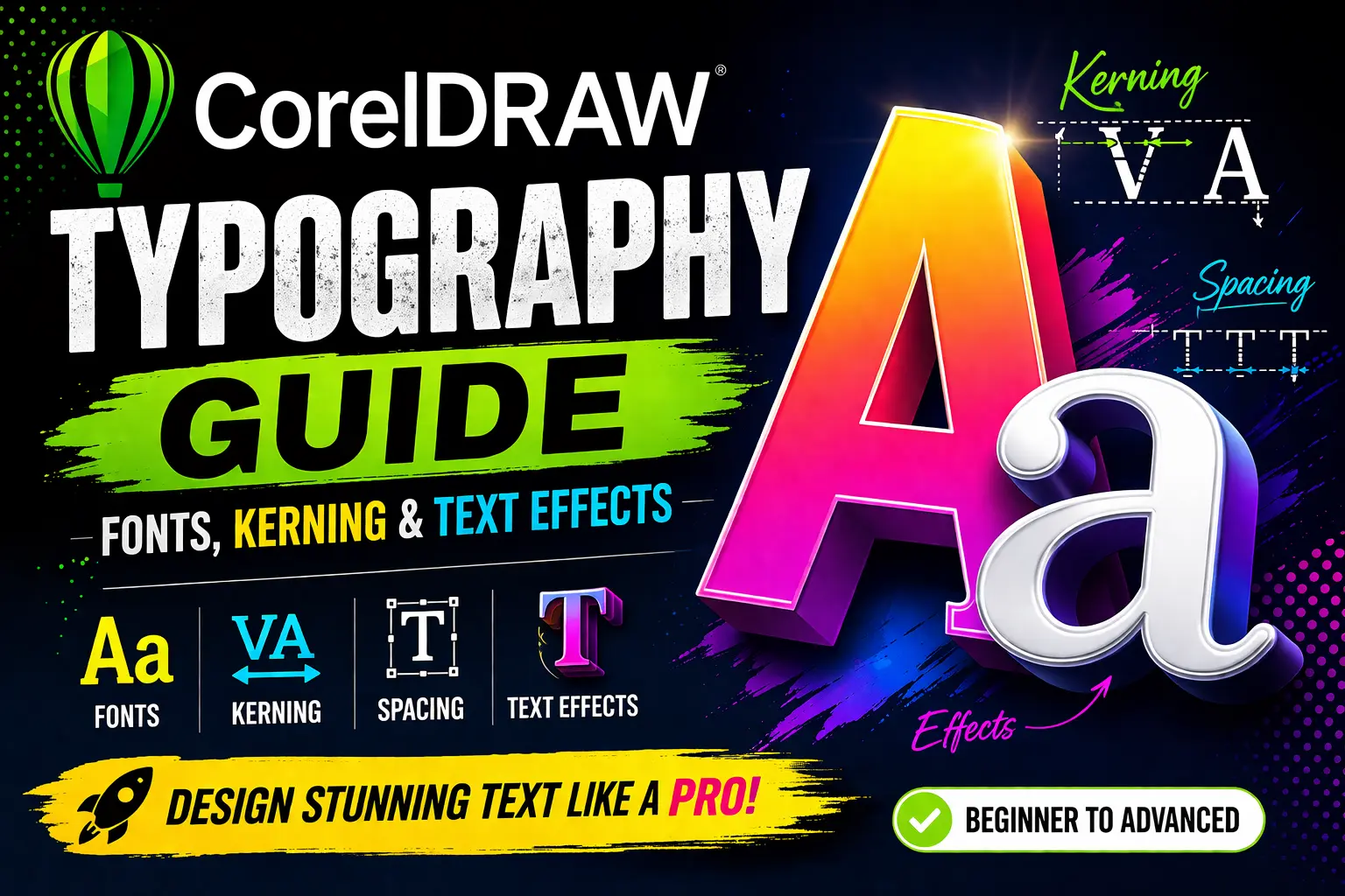
Typography is the backbone of graphic design. Whether you’re designing logos, posters, social media creatives, or business cards, the way you present text can make or break your design.
In CorelDRAW, typography isn’t just about typing words—it’s about crafting visual communication.
This comprehensive guide will take you from beginner to advanced level in CorelDRAW typography. You’ll learn how to choose fonts, adjust kerning and spacing, and apply stunning text effects to create eye-catching designs.
1. What is Typography in CorelDRAW?
Typography refers to the art and technique of arranging text to make it readable, visually appealing, and effective. In CorelDRAW, typography includes:
- Font selection
- Text alignment
- Spacing adjustments
- Text effects
- Layout design
CorelDRAW provides powerful tools that allow designers to control every aspect of text.
2. Understanding Fonts and Typeface Basics
Before diving into CorelDRAW tools, it’s important to understand typography basics.
Typeface vs Font
- Typeface: The design of lettering (e.g., Arial, Times New Roman)
- Font: A specific style within a typeface (e.g., Arial Bold, Arial Italic)
Types of Fonts
Serif Fonts
- Classic and traditional
- Example: Times New Roman
- Best for: Print, formal documents
Sans-serif Fonts
- Clean and modern
- Example: Helvetica
- Best for: Digital designs
Script Fonts
- Handwritten style
- Best for: Invitations, branding
Display Fonts
- Decorative and bold
- Best for: Headlines
3. How to Add and Manage Fonts in CorelDRAW
Installing Fonts (Windows)
- Download font file (.ttf or .otf)
- Right-click → Install
- Restart CorelDRAW
Managing Fonts
CorelDRAW allows you to:
- Filter fonts
- Preview fonts
- Organize favorites
4. Choosing the Right Font for Your Design
Font selection depends on:
- Purpose (logo, poster, web design)
- Audience
- Brand personality
Examples
- Corporate: Sans-serif
- Luxury: Serif
- Creative: Script or Display
5. Font Pairing Techniques
Using multiple fonts correctly enhances design.
Rules for Font Pairing
- Combine serif + sans-serif
- Avoid using more than 2–3 fonts
- Maintain contrast
Good Pair Example
- Heading: Montserrat
- Body: Open Sans
6. Text Tools in CorelDRAW Explained
CorelDRAW offers two main text types:
Artistic Text
- Used for headlines
- Flexible and scalable
Paragraph Text
- Used for long content
- Supports formatting and columns
7. Kerning, Tracking, and Spacing
Typography is incomplete without proper spacing.
Kerning
Adjusts space between two characters.
Tracking
Adjusts spacing across entire text.
Leading
Controls line spacing.
How to Adjust in CorelDRAW
- Select text
- Open Property Bar
- Adjust spacing values
8. Paragraph Formatting and Alignment
CorelDRAW provides multiple formatting options:
- Left align
- Right align
- Center align
- Justified
You can also adjust:
- Indentation
- Bullet lists
- Columns
9. Working with Artistic vs Paragraph Text
Artistic Text
- Best for logos and titles
- Can be converted to curves
Paragraph Text
- Best for body content
- Supports text wrapping
10. Advanced Typography Techniques
Convert Text to Curves
- Shortcut: Ctrl + Q
- Allows full customization
Node Editing
- Modify shapes of letters
- Create unique typography
11. Text Effects in CorelDRAW
CorelDRAW offers powerful effects:
Drop Shadow
Adds depth to text.
Contour Effect
Creates outlines.
Extrude Effect
Gives 3D look.
Transparency
Adds modern style.
Envelope Tool
Distorts text creatively.
12. Working with Curves and Text Paths
Text on Path
Steps:
- Draw a shape
- Select text
- Click “Fit Text to Path”
Benefits
- Circular logos
- Creative layouts
13. Creating Logo Typography
Typography is crucial in logo design.
Tips
- Use custom spacing
- Avoid default fonts
- Convert to curves for uniqueness
14. Typography for Print vs Digital
Print Design
- Use high-resolution fonts
- CMYK colors
- Serif fonts work well
Digital Design
- Use web-safe fonts
- RGB colors
- Sans-serif preferred
15. Common Typography Mistakes to Avoid
- Using too many fonts
- Poor spacing
- Ignoring readability
- Overusing effects
- Using default kerning
16. Pro Tips for Professional Typography
- Always adjust kerning manually
- Use grid alignment
- Maintain hierarchy (Heading → Subheading → Body)
- Test readability
- Keep it simple
17. Conclusion
Typography in CorelDRAW is a powerful skill that can transform your designs from average to professional. By mastering fonts, kerning, spacing, and text effects, you can create visually stunning and impactful designs.
Whether you’re a beginner or an experienced designer, consistent practice and experimentation are key to mastering typography.